What is the 3-30-3 Rule?
No, the 3—30—3 Rule is not Tweedle Dee’s proportions. In marketing, it’s your way of knowing how your website’s home page is performing. In this age of shrinking attention spans, you have just a few seconds to grab someone’s attention.
The 3-30-3 Rule as we have applied it here is
“You only have one chance to make a good first impression.”
Visitors have to get you in the blink of an eye. Yup, in under 3 seconds.
How does your website perform? If you are not opening anybody’s wallet, then it’s not doing its job.

Here’s how the 3-30-3 Rule works:
- If they keep reading for 30 seconds, they know they are in the right place for their search and are interested in your product or service. Even better.
- If they stay on your site for 3 minutes, an elephant’s life on the web, you have engaged them. Now, you are more likely to convert them to a customer.
This is exactly what you are looking for in 3—30—3.
Check out our website design work
How to catch people’s attention on your Home Page in less than 3 seconds:
The 4 things people process in just a few seconds are:
- Your headline
- Your visuals
- Your first few lines of copy
- Overall presentation
The main headline on a website, brochure, presentation—or really anything—has to make a big impact.
A note about the current crisis…I believe we all have the knowledge and skills to get people through this crisis and come back even stronger. You just have to let people know your product is the right medicine to relieve their pain.
That’s why I created a Guide to Winning New Business—Even now! Download it here!
Encyclopedias have been written about how to create a big brand strategy.
But hiring a pro who knows how to do it is the best investment a company can make, because this story stays with you forever. At Network9, we are hell-bent on creatively guiding companies to win new business. Schedule a strategy call with The Boss Lady.
Once we create the concept, a verbal and visual story can unfold. This story can be repurposed in all your marketing materials.
Explore our Brand Strategy Process
Your headline has do one or more of these 3 things— and in 3 seconds:
- What the customer gets (what’s in it for me?)
- The problem you solve (pain point)
- What you offer (product)
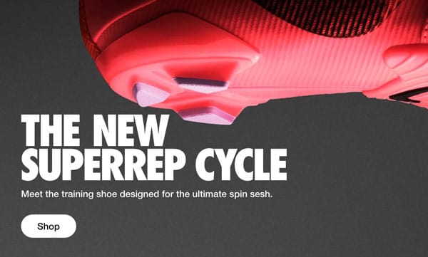
Here’s a good example:
The above headline works on all 3 levels. Nike starts with what they offer (training shoe), designed for (solving problem), and ends with what the customer gets (an ultimate spin sesh)
The headline tells me I can fill my needs, what it is and why it’s great. Bam!
In the 3-30-3 Rule, visuals can grab the eye – but there’s a pitfall.
If your visuals don’t match your brand story and headline concept, it just doesn’t do it.
Many businesses use images of the city they are in because they haven’t created a story to tell. Imagine choosing images for a children’s book without having the words to the story!
Generic, unemotional images fall flat, and it doesn’t even take 3 seconds.
A client came to us for a redesign and showed us images of lighthouses they wanted to use for the home page. My answer was, maybe, maybe not, depending on the brand concept and headline.
That actually won me the job. Footnote: we did not use lighthouses.
Take a look at our video. We asked our friends, family and colleagues to make us fall in love with them in 3 seconds to illustrate this point. It wasn’t easy, but was a lot of fun!
Website analytics at work
An analysis of your website can help you gather extremely useful information. Analytics are easy to get, such as installing Google Analytics. Look to see which pages have been viewed, and how long they stay—if they come to your home page and leave (bounce rate), it’s time to seriously reassess your website.
A good web designer will know what to look for, be able to evaluate your home page and website with an experienced eye, and advise you on how to improve it to engage visitors and lead them to view more pages, which can, of course, lead to a sale.
Is your Website working hard for you?
Let’s face it—if your site is more than 3 years old, or looks it, it’s not doing its job. Your website is your “Virtual Voice” out there selling for you, 24/7, and should be winning you new business.
Design changes, technology gets more advanced, and the user spends less time searching. If you are not on the responsive website train, get on board now.
An out of date website shows you are out of date in your expertise.
Worse than ANYthing is if your website is old-fashioned, people will think you are too. Nobody wants to work with a dinosaur.


