Here are some great examples of logo redesign that made sense—and why.
A change to a company’s visual identity is a big deal and should be approached with good reason and a sound strategy.
A logo is often the first thing a client sees when they interact with your marketing. It should mean something and represent the company in a meaningful way. Grabbing a swish off the internet and throwing some type over it is nooooot a great way to go.
When contemplating a logo redesign, think about why you want to do it.
The reason why will be the basis for the designer to create a new idea. Change is good. Unless you have a very good reason to redesign your logo, don’t do it. There is valuable equity in your identity. Read our post on when to redesign a logo and when not to
At least, that’s the philosophy of the titans of business when it comes to their corporate identities.
Often a logo redesign is a part of rebranding a business.
Read our post on Why Rebrand here
From Apple to Walmart, here are some companies that have revamped and redesigned logos to reflect new values or to serve a new purpose.
Reason #1: Name change
Since just about everyone called them “Fedex” instead of “Federal Express” they just rolled with it. The Fedex logo is often studied for the cool way they used negative space. The arrow formed by the E and the X is one of the best uses of this idea and much admired by designers.
The color system they developed form this one logo delineates each of their products but maintains the family brand. All in all, a great logo redesign.
![]()
Reason #2: A merger
Exxon Mobile’s logo redesign history
The original Standard Oil logo stood for many years. When it was deregulated, it broke off its companies in separate corporations. Two of them stayed separate for many years. They needed to rename and redesign their logos.
Today, they are reunited as Exxon Mobile. They retained the color palette, added those gorgeous X’s, and succeeded in their redesign.
I love that on the second Mobile iteration, they went back to the perfect O’s of the original. If I remember, they used to have an animation of liquid gas swishing around the inside, like a washing machine. I miss the contrasting color of the O, it added a special touch.
![]()
Reason #3: Simplification
![]()
Some of the most iconic logos, like the Playboy bunny and Steve Jobs’ half-bitten apple, weren’t always so memorable. In their original versions, Playboy and Apple’s logos were cluttered and overly intricate. It was very difficult to reproduce in small sizes and just didn’t work.
Hugh Hefner brilliantly brought in Art Paul to reimagine the famous bunny. It was a part of the original logo, so he smartly kept the symbol, but turned it into a lasting icon.
“The rabbit, the bunny, in America has a sexual meaning, and I chose it because it’s a fresh animal, shy, vivacious, jumping – sexy. First, it smells you, then it escapes, then it comes back and you feel like holding it, playing with it. A Playmate resembles a bunny. Joyful, joking,” Hefner said.
Apple, now the industry standard for design
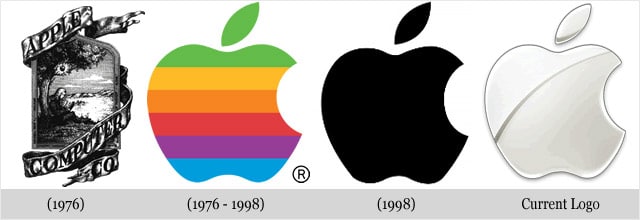
Apple’s original logo shared a similar problem. It was too complex and cerebral. Not at all up to Jobs’ later standards for minimalism. The original version showed a scene of Isaac Newton making his discovery of gravity from an apple field, making the point that an idea can literally hit you over the head.
Jobs wisely abandoned it for something more simple and clean, with the bite giving it distinction and a little rebellious feel. The rest is history.
As he was quoted:
“That’s been one of my mantras — focus and simplicity. Simple can be harder than complex: You have to work hard to get your thinking clean to make it simple. But it’s worth it in the end because once you get there, you can move mountains.”
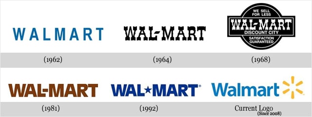
Reason #3: Looking outdated
Even though you may be tempted to throw out your “old” logo, people still need to know what to expect from you. Consistency builds trust. And trust is everything in business.
Wal-Mart has evolved its logo several times over the years without losing its core look. In 1964, somebody decided they wanted to look like a Trading Post, but that quickly got old-fashioned looking. The current logo used since 2008 depends on its clean, clear typography, relaxed design and that something-or-other yellow icon.
Volkswagen has evolved but not changed substantially
![]()
This is a great example of a successful logo redesign. It takes the beautiful interlocking V and W and simplifies it, making it the standout in the design. the result was a more modern design.
When a logo redesign didn’t work
UPS: Changing a very good thing
UPS has maintained consistency too, but we’re not sure why they changed their beautiful design by Paul Rand, who also designed the logos for ABC and IBM. Hey UPS – if it ain’t broke, don’t fix it!
The new logo just doesn’t have the same “it’s a present” idea. For us, this logo redesign doesn’t work better than what Rand did.
![]()
If any of these major business changes trigger a need for a logo redesign, that means business is growing.
Read more about when to and when not to redesign a logo here
Talk to a brand consultant before throwing the baby out with the bathwater. Thinking and talking it out with a designer can make the transition easier and assure you get it right the second time. Your logo should last longer than a good pair of shoes.
![]()