We all know the adage: if it ain’t broke, don’t fix it.
But apparently, some top businesses didn’t get the memo. When it comes to changing your brand identity, which may include your logo—tread carefully. Especially if you’re a well-established brand. Familiarity does not necessarily breed contempt. People trust what they know. It is important to know when to redesign a brand logo. And when not to.
So if you’re thinking about redesigning your logo, have a good reason.
Let me make something clear: A logo redesign is NOT rebranding.
There is a ton of confusion about this term. Logo redesign is often a PART of rebranding and represents the new positioning of the company. When a company rebrands, it is a major undertaking that transforms the entire context of their marketing position. The rest follows, including but not limited to the logo. We address the pros and cons of rebranding in this article
When TO redesign a logo
- a new business focus
- a change in the direction and scope of services of the company
- evolution of corporate identity, like a name change
- merger or acquisition
- The logo is so old there are no consistency standards
- the logo really looks outdated
- it no longer represents the company accurately
How drastic a change should it be?
If any of these things apply and the time is right, begin by looking at your present logo. Decide which elements of the logo should be retained from the old identity. No sense throwing the baby out… Should it be an evolution—or a revolutionary new visual concept? It is often wise to retain the equity you have built with your brand’s logo.
Knowing when to redesign a brand is crucial, and when done with a sound strategy, change can be a positive step forward.
Reason #1: Solving an identity crisis
In this logo redesign, a group of companies owned by the same entity had 6 different but visually unrelated logos. They needed a cohesive family brand, consistent in design and color. They had no brand standards for color and fonts and were lacking proper file formatting for use in any size or project.
This was a genuine crisis in their identity, but we did not want to lose the equity of the current designs. We used the familiar bold interlocking letters as the basis of the redesign. We standardized the orange and green colors and used the same icons on all the logos. Now wherever their brand appears, they are recognized as one company. Read the full case story here
![]()
This is the old family of logos:

Reason #2: Confusion
In this example, one of our clients, Townhouse Partners, had grown tremendously as a business and their needs changed. They were targeting a higher level of client, and it was time to evolve their entire brand. Their original logo sent the wrong message to their clients, who mistook them for real estate brokers.
![]()
We designed a new logo to reflect the real estate consulting professionals they are. The square shape is a reference to a plot of real estate and made from their interlocking initials which are a nod to buildings. Now their logo represents them accurately and has a more polished, professional look.
![]()
Here are some of our favorite logo redesigns:
![]()
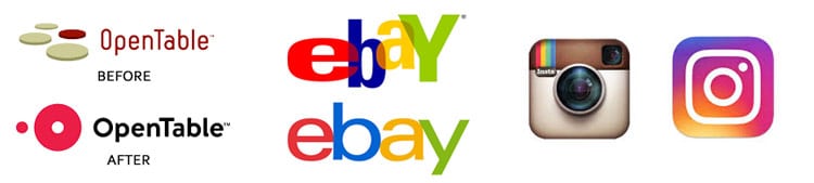
Reason #3: Modernization and simplification
Google’s logo is a great example of a logo evolution, not revolution.
Over the years, they lost the embossing and drop shadows we loved when we first got Photoshop. What were we thinking!? I love today’s version.
However, I think the spacing of the g-l-e is too tight and the G looks like it is falling backward. So I tweaked it for them. The original is the one on the RIGHT. It’s subtle, yes.
![]()
These are others that evolved instead of being completely redesigned.
They keep the spirit of the originals. They are more iconic, which given all the applications these logos have, it makes sense. I still like the original ebay logo, it was much more energetic and fun. The Instagram logo was destined for simplification with all that detail and shading.
When NOT to Redesign a Brand
If your logo is as gorgeous as this one, leave it alone! Aside from Ed Bengiuat (Art Directors Hall of Famer) perfecting the lettering somewhere along the line, this logo hasn’t changed much. Nor should it.
![]()
Sometimes, though, it is indeed better to leave things the way they are.
The beautiful, elegant font of The Gap, which looked great inside their clothing and is recognizable to everyone, was mysteriously changed. We get it.
Carmen says “They may have been thinking to use a more contemporary sans serif font, like classic Helvetica. The added square may have been added with the intention of changing its color for different clothing lines. Not a bad idea, but it was just too different, and not as distinguished. They lost the equity they built in the original, clean elongated font.”
The biggest Logo makeover oops of them all? The Gap.
![]()
Gap: Crap
This was the PR disaster to end all disasters. Designers everywhere took up arms in protest! It even got a nickname: Gapgate.
Gap’s mistake was radically changing everything. The old logo, which was used for more than two decades, was well-loved and familiar to all. The updated logo was designed by Laird & Partners to try to achieve a more contemporary and modern look. The problem was, the new design looked more like Microsoft clip art than the logo of a Fortune 500 company. Designers bestowed their judgment:
![]()
Gapgate provoked such ire from the design community that the normally neutral AIGA officially protested it. Then, the Siegel + Gale design agency wrote an open email letter to Patrick Robinson, Gap’s VP of global design.
“This is what happens when you take a company field trip to a screening of Helvetica,” they wrote.
Siegal + Gale’s office happened to be directly across the street from Gap Inc’s offices, and when Patrick didn’t respond to their logo complaint, they found an ingenious way to get his attention:
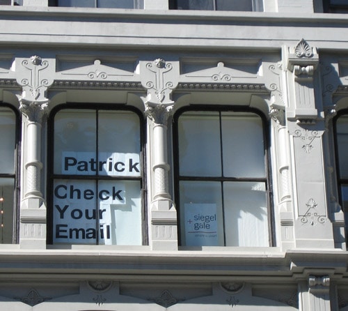
That’ll do the trick. Finally getting the point, Gap returned to the one we all know and love.
Moral of the story? Don’t mess with a well-loved brand and image valued at $4 billion. That’s a lot of brand equity.
Rule #1: Don’t mess with a classic, especially if Paul Rand designed it
UPS also should have gotten the memo. UPS changed its classic Paul Rand-designed logo that had been the face of the company for 40 years. Wanting to emphasize that they deliver more than just packages, they ditched Rand’s shoestring-tied parcel, which his granddaughter deemed “looks like a present”, for a brown and gold shield. Rand, a legend of logo design, also created the IBM and ABC logos. This guy knew what he was doing. Change his work with extreme caution.
A side note on Paul Rand
![]()
An article on logo redesign would be incomplete without mentioning this designer. Every graphic design geek knows who he is and the impact his work has had on design. He literally wrote the book on brand standards, the holy bible of designers today. His iconic IBM logo is so thoughtfully designed it hasn’t been changed since 1972. It was so clever, designers have created zillions of cool variations of it, from repeating patterns to complex illustrations, all recognizable to customers. Moral of the story: Think it out, anticipate how it will be used, add a splotch of difference, and have a great idea to start with.
“The value of the logotype, which is the company’s signature cannot be overestimated.”
-Paul Rand
Read the whole story on the IBM logo and Rand here
Rule #2: Be careful with how you use color.
![]()
MasterCard learned that the hard way when they dulled their color palette from bright red and yellow to rust and beige. Blech.
“It looks like someone threw up on the MasterCard logo,” opined the blogosphere.
We loved the two intersecting circles of bright colors which were used so well as brand elements in all their ads as well. Luckily, the geniuses at Pentagram got it too. Here’s the 2018 version, which keeps the well-recognized 2 circles, but cleans it up and makes the design more flexible. Read the whole redesign story here. It is a perfect study in when to redesign a logo—and when not to.
![]()
Rule #3: Don’t muck it up
Kraft’s logo redesign took something crystal clear and made it confusing.
The distinct red and blue bold, clean logo which you can see a mile away, (like on your packaging in the supermarket) was replaced in 2009. The hodgepodge of colors they called the “Spark Logo” didn’t retain enough of Kraft’s old visual identity. They lost all sense of direction with this cheesy logo. This was way too revolutionary.
Change your look, but don’t lose yourself.
![]()
They came to their senses in 2012, and went back to the older, but curiously more modern logo design, with a few tweaks. See if you can see the difference. Read the case study here
![]()
Rule #4: make up your mind.
What’s going on here? Change we can’t believe in, that’s what.
When it comes to logo redesign, how often is often enough — and when is it just too much? Pepsi, with its iconic use of red, white, and blue, has achieved a lasting and legendary brand. But sometimes we think they switch their game up too much. Once they get one they like, they should stick with it. Check out their evolution below.
We’re on the fence about this one. On the one hand, Pepsi at least keeps consistency through color, even amidst its changes. It looks like they started out mimicking Coca-Cola in 1898, so in 1940 they wanted to create a new identity of their own.
We rather like the 1973 version. Looks the most modern and sharp. But they just kept going! It’s just plain confusing that they switch their look so much. Can a soda have an identity crisis? By the looks of it, yes.
![]()
Is the glass half empty or half-full with this one? You tell us.
The latest version of the Pepsi logo also looks familiar. Designing an original logo: Yes we can?

We just hope Obama doesn’t prefer Coke.
Rebranding is a tricky business. When it goes right, it can lead to unprecedented success. But when it goes wrong, it goes very wrong.
Take it from Prince (excuse us, “The Artist Formerly Known As Prince”): symbols matter. And when they’re confusing or misleading, that’s just bad business.
Don’t fall into that trap. If it ain’t broke, don’t fix it.
![]()