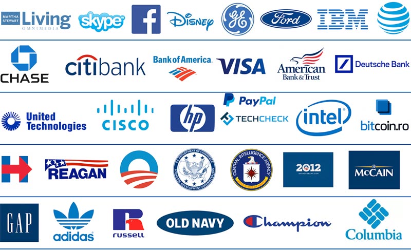
Think Blue for Logos: Blue is the Hue of Success
Back when Facebook was still THEfacebook.com and Mark Zuckerberg was just another college dropout, he stopped in the marketing house Cuban Council (as the legend goes), and asked, “Tell me guys…what is design?”
Joe Kral, who had no idea he was about to design one of the world’s most famous logos, replied, “Design is the 24/7 voice of your company.”
With that in mind, Facebook set out to find its visual voice.
And as it did it also set the trends that other social media sites would follow. Blue is so widely used we wondered why we love them so much.
Facebook was the first was to think blue for social media, and for this industry, blue is the new black. The three queens of social networking –Facebook, Twitter, and LinkedIn – all use blue logos. Why?
Facebook’s logo is blue for a surprising reason
For Facebook, the answer was more simple than you might think. Mark Zuckerberg is red-green colorblind, and blue is one of the only colors he can see in all its vibrancy.
But blue worked for other reasons. From Superman’s suit to Tiffany’s box, blue is a staple of cool in American pop culture. In the 21st century, its implicit association with blue jeans affirms the color’s hip and youthful sensibility. Blue is soothing, the color of the sky and an easy to love color. It’s even the name of the most Google’d baby in the world, Jay Z and Beyonce’s “Blue Ivy.”


Blue is also the color of business, royalty and power
Blue dye was rare and expensive throughout history, which lead to its association with royalty and power (hence the phrase, “blue bloods” for aristocracy). The Ancient Greeks had entire factories dedicated solely to making blue, and it got an even bigger bump in 434 AD, when the Catholic church color coded the saints and chose a blue robe for the Virgin Mary.
It has been seen as a trustworthy and reliable color ever since.
Paul Rand kicked off the modern era’s use of corporate blue when he created the iconic IBM logo. Would you believe that the original version was black and white and had no stripes? This one is so good it’s lasted for like 60 years. Still looks fresh. Read the story of this logo here

Blue was the perfect hue for Facebook, the site that launched a thousand social networks.
For their logo, they reworked the font Klavika, a do-it-all sans serif of the 21st century.
They used all lower-case letters to create a friendly, non-intimidating vibe. Sites like Twitter would replicate the lower-case fad, which signals that social media is a place where users can be casual and not worry about their grammar.
Facebook’s logo was an instant hit. The other social media sites took notice, and soon Twitter and LinkedIn were using blue too. Pinterest and Instagram took a different approach to their brand color with great success.
Pinterest uses red and, not surprisingly, 75% of its users are women. Other technology sites like Skype and PayPal also use the favorite hue, but in a more aqua shade.
Across social platforms, blue is the hue for logos.
Blue is the color of choice in big business, finance, banking, technology and political campaigns. It brings status and is long-associated with power and widely used in the corporate world.
But in 2019, this year’s newest candidates are departing from the traditional red, white and blue for more offbeat colors.
When a company is rebranding or redesigning its logo, the color they choose will have a great impact on their brand.
Read more about when and when not to redesign a logo

