The trend in movie posters: do they all look the same?
From E.T. cycling across the full moon, to Jaws thrashing out of the water, a great movie poster can become a Hollywood icon. But we’ve been noticing certain similarities and wondered why so many movie posters look alike.
Although movie studios typically drop $100,000 per poster, they often fall prey to formulas and “I’ll have what she’s having” designs. Keep an eye out for these design fads in movie posters next time you hit the multiplex.
Dynamic Duo: Blue and Orange
When it comes to design fads in movie posters, there’s no question which colors rule. Blue and orange. As Jason LeDuc’s infographic shows, the color combo is a marketing hit. Watch out — once you start noticing it, you’ll see it everywhere.
See what we mean? There’s no getting away from it.
Blue and orange are a powerful combination because unlike other color pairings — red and green, pink and blue — they don’t conjure cultural associations that are already set in stone. They sit on opposite sides of the color wheel, evoking the two poles of hot and cold and explosive action. And don’t Hollywood ad makers know it.
Romantic Comedies: Think White
Hollywood sends us another signal when it wants us to think “comedy.” In this compilation, French film scholar Christophe Curtois highlights the trend of a white background, which sets a light, friendly, and understated scene.
Like a blank canvas, the white space leads our eye to the actors.
We feel like we’ve seen the star couple leaning back to back before — because we have.

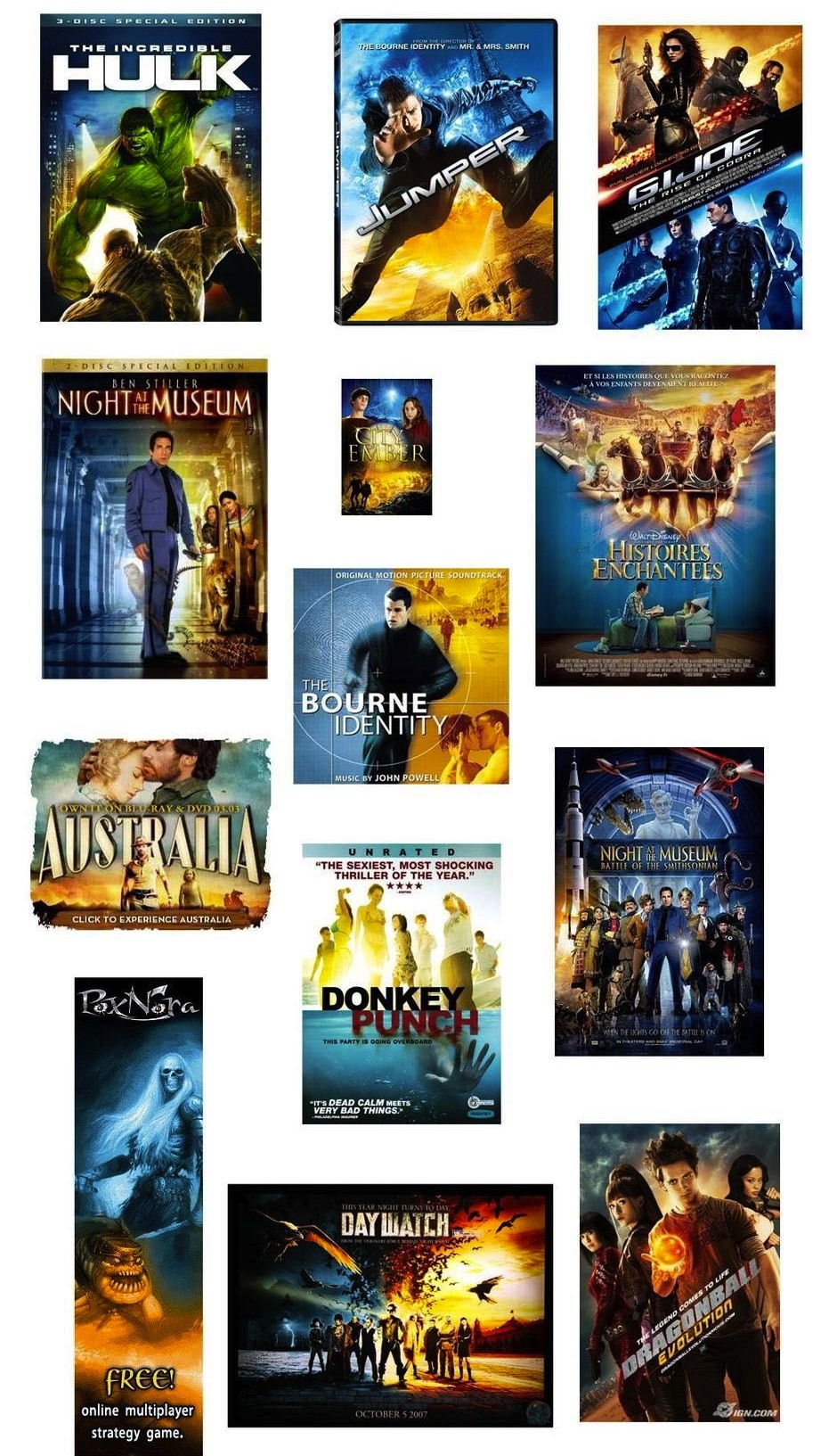
Welcome to the Dark Side
Are our movie posters getting darker? In 2012, software engineer Vijay Pandurangan proposed a theory that posters have become both more dark and more blue over time.
Using color data from 35,000 movie posters created from 1914 until now, his final image below shows that’s he’s right.

Christophe Curtois offers more evidence that Hollywood has gone dark. Last week we told you that blue is the hue for logos, and it appears the proof is in the poster too:

Why so serious?
One explanation for the posters’ shifting hues is that they reflect differences in the genres making waves at the box office.
The popularity of action, thrillers, and sci-fi of the past decade may have led to a darker and more “masculine” palette.
Some film theorists speculate that 9/11 and the economic downturn have led the public to crave grittier stories, since a sugarcoated world no longer feels real to them.
Compare the ’90s-era Batman and Bond movies — full of camp and comedy — to their gritty modern counterparts and you’ll see a distinct difference in style.
Studios also want to quell fears that big-budget franchises like Spider-Man and Harry Potter might not appeal to an older audience. A dark color scheme lends an air of intensity and importance that can help hook that audience. However, this strategy isn’t working for everyone. It recently led Rolling Stone to lament, “Cheer Up, Guys: Why Are Our Action Heroes So Depressed?

If you need a little light after all that darkness, here’s a sunnier formula used for independent movies: the all-yellow poster.
Indies need to stand out against studio films with big stars and bigger budgets. Christophe Curtois shows us how a bold yellow contrasts with the dark landscape of mainstream movie art. In a world of Batman and blockbusters, why not stand out by adding some sunshine?

The formulas work—a lot of these posters have produced huge hits. But we can’t help but feel that relying on these standards is a bit like choosing McDonalds. It’s there, it’s easy, but at the end of the day it’s unsatisfying.
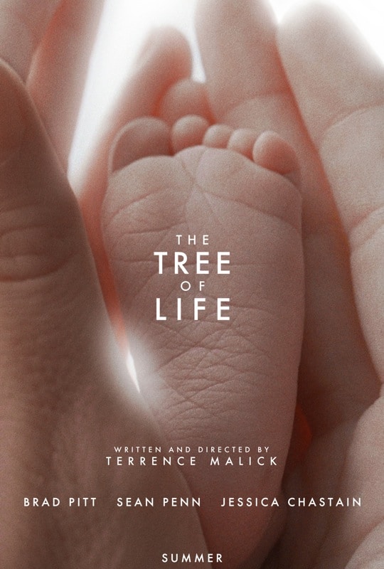
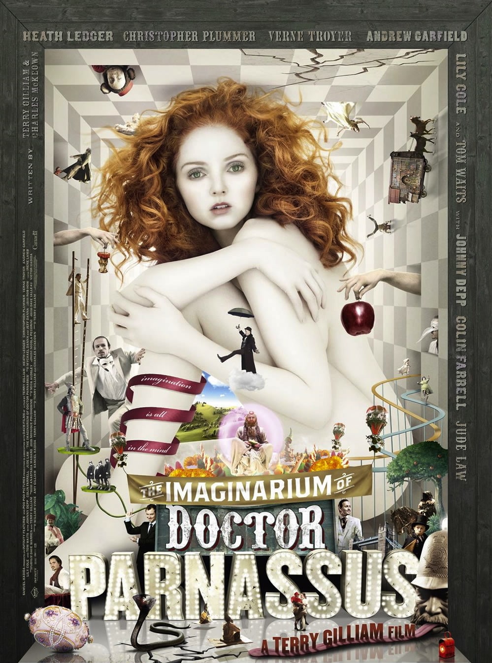
Why be cliche when you can be visionary?
As designers we appreciate when movie posters dare to be different. Here are some from recent movies that avoided ho-hum, nothing-new-here designs. We’re glad they did:

The next time you visit the multiplex, look at the movie posters and see how many similarities in design you can find.