Website Redesign Basics
Design and technology are evolving rapidly every day. New technologies like responsive layouts and an abundance of new plugins add new functions to your site easily. If your company has changed direction, grown, merged, or added services, these are great reasons to redesign.
If people aren’t contacting you and little business is generated from your website, it’s time to look at why.
Design has become simpler over the years. Clients keep asking us for a “clean” site. What that means to us is less long blocks of text, more images, and more space around the elements. It means find the one most compelling point for the brand and provide just the right amount of text to answer people’s questions. Less clutter leads to better retention.
These are 9 things to check for on your Home Page when doing a website redesign project. Some seem obvious, but you’d be surprised how often they are overlooked.
1.) Have A Clear Description Of What You Do
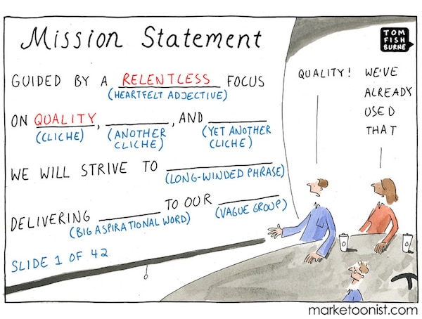
Your website redesign project is the best time to evaluate the basics. First, let people know they have come to the right place to get what they are looking for. If you’re an attorney, just say so. A mission statement used to be a requirement, but if it doesn’t tell people what you actually do, it’s pretty useless. “We make shoes that make you walk comfortably” may not be catchy, but it sure is clear.
You’d be surprised how many home pages say things like “Learn to Live Better and Love Yourself” as the description of their business’ services. There are a lot of ways we can learn to live better. Exercise, diet, therapy, Vegas, reading, etc. Just be clear, so people know they’ve come to the right place.
2.) Use Real Pictures To Underscore Your Ideas
Websites are getting more and more visual. One picture speaks…. This graduate student wearing a white leisure suit, smoking a cigar, and sending important work emails on what appears to be a digital game of Battleship from the early 2000s is here to show you that stock photos can only take you so far. (Thank you for this bizarre gem, StockPhoto site.)
Having a real picture of your product, your company or you in action doing what you do helps people get you immediately, builds credibility and makes a connection. Make it personal, with some ACTUAL photos of REAL people. Photographers are way better than using a phone for this. Quality counts.
3.) Make Contact Information Prominent
If your business benefits from people calling or emailing you, MAKE THAT EASY. It usually goes in the upper right-hand corner of your header. Or, make it a BIIIIG BOX; not a tiny unreadable line in dark grey text in a light grey corner. Use contact forms in your sidebar and keep them short and sweet.
4.) Build A Responsive, Mobile Version Of Your Site
Really guys. It’s 2014. Everyone and their grandmother has a smartphone. Your website needs to be mobile responsive, end of story. Call us if you have any questions about this. Oh, and you do get points from Google for this.
5.) Do Your SEO Homework
Optimizing your site for search engines is RIDICULOUSLY beneficial to your business, and produces real results. Why do a website redesign that looks great if no one finds it? It’s like building a super cool sports-car and leaving the engine out. It will look good, but go nowhere.
Do your research, find an expert (like us!), and let SEO do the marketing work for you. SEO moves you up in the organic search results. It is not the same thing as SEM (That’s when you pay.) There is a science and an art to this and an expert can make the difference.
6.) Use Social Media Share Buttons To Encourage People To Share
First, choose the right platforms for your business. See above chart. Make your content easy to share on FB, Twitter, Pinterest, etc. Share buttons at the bottom of your pictures and posts are invaluable. If people share it, you are doing your own SEO. Yes, really.
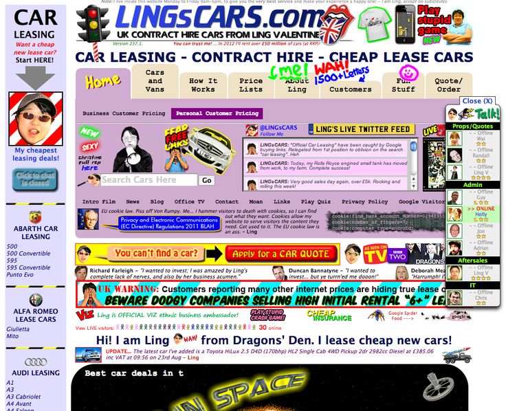
7.) Make Navigation Easy! NOT Like This…
Have one single focal point on your home page, not 40. Imagine if you visited the website in the image above, where do you look? No one know what they are supposed to be looking at and it may even cause seizures. You need to make an easy to find navigation bar that lives on every page, with clear labels (this is not the place to be clever). Most people know clicking on a logo will take them to the homepage. Keep it simple.
8.) Include A Privacy Policy
You should include a privacy policy. There are generic ones out there for simple sites, but have an attorney look at yours so you are sure it’s appropriate for your business. You can get penalized by Google for omitting this. Please don’t ignore Google, or they will ignore you.
9.) Test Your Website For UX In Action
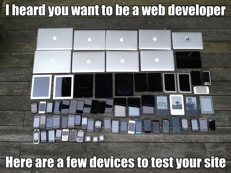
This may sound obvious, but it is often overlooked. Test your website before you launch it to see how it works when people experience it. It’s important to find out how it performs different devices, and not just if your links work. Use actual people to do this. Give them a task and see if they can do it. For example, ask them to find the price of a certain product or see if they have the service you need. If they have trouble doing this, you can tweak your site to fix the problems you detect.
This is UX in action, and can make or break a user’s experience of your website. Click every link on your website to see if it leads to where it should. Try try to break your site or try to get a dead end or error page. If you can find these problems, so can someone else.
Errors cause mistrust. Even a fun 404 error page can help people feel there is a real person behind your website.


