Think of your brand identity as a uniform for your business.
“Uniform” literally means “One Form.” An actual uniform helps identify a person from a particular company—think the brown uniform of the UPS guys, a white nurse’s uniform, or the staff in blue at Best Buy. People know what to expect from someone wearing a uniform.
Without uniforms, soldiers would be firing off at the wrong side!
Here’s why the best-dressed brands wear a uniform: to help people identify them and build recognition.
But trust is a fickle thing, and building it takes some thought, planning and effort. As fleeting as something like a label or a Facebook profile picture may seem, its influence can echo much further than one glance. If your colors are helter-skelter and you use a different font every few months, clients will get the clue that you don’t have your act together.
That’s why brand guidelines are essential: your fonts, image style, logo, and graphics should all follow these guidelines. You should be visually consistent across different mediums, from your newsletter to your business cards to your Pinterest page.
Learn more about our Brand Strategy work
Familiarity does not breed contempt.
Sending consistent visual cues helps people become familiar with your brand, creating a safe and comfortable experience. Think of McDonald’s. It doesn’t matter whether the McDonald’s is in New York or New Mexico: the experience is virtually identical. You can count on those red and yellows, uniform packaging, and even the size of your Big Mac is regulated. Mickey Dee’s proves it. Consistency is king.
This strategy works for small companies too. Work diligently to achieve brand consistency. It will do wonders for your business. So throw on that uniform for your business. This is a brand that is dressed for success.
Etsy – Gets It Right Across The Board
Etsy, the online marketplace for handmade crafts and vintage finds, is a master of brand consistency. Check out how they stick to their visual formula across different social media platforms, choosing images and a writing style (their virtual voice) that are tailor-made to reflect their corporate philosophy:
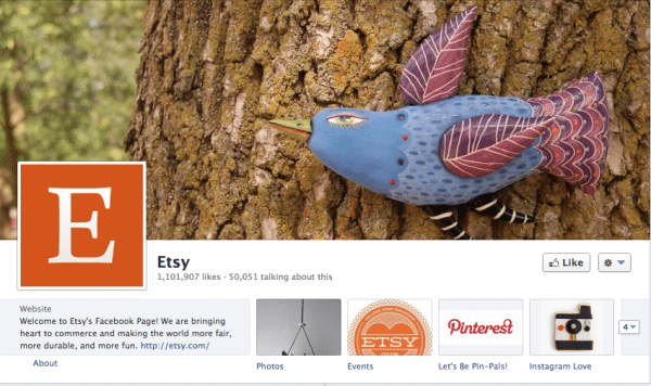
Etsy keeps true to its earthy, orange-based color palette on its Facebook page and also highlights its unique crafts with the picture of the cloth bird. Its font, Minister EF Book, is a riff off literary typefaces that is coined and owned by Etsy, and appears on all of its digital promotional tools.
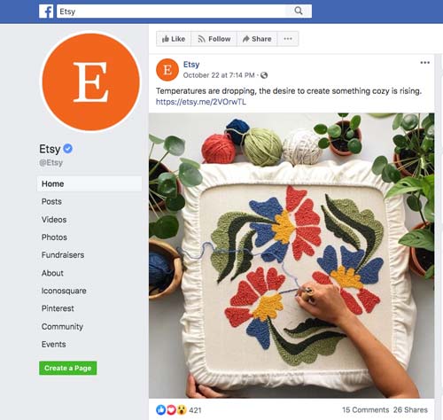
Etsy, in addition to always using their orange color template and Uppercase E logo, always highlights a different handmade product on each of their networks. This shows that you can add variety to your marketing while still achieving brand consistency. In this case, it sends the message that Etsy as a brand is like the products it sells — one of a kind.
Etsy’s gift cards use a hand-drawn icon and jaunty text that speaks to their clientele. Etsy walks the walk. They sell products with a personal touch, and their brand has a personal touch too.

Etsy’s signup form to create a shop, uses the had-drawn icon that appear in their gift cards and other places. They even give their users a piece of their branding with the sale tag below that vendors can put on their sites. Its design is bright, fun, and sophisticated —just like Etsy.
![]()

Even if you’re not as big a company as Etsy, you can follow these same principles.
Play like the big boys. Act like a franchise. Get dressed for business — and wear your uniform proudly.