A transformation for the GoldenSource website design and rebrand
GoldenSource was at a crossroads in their company’s history. As a financial software company, their 25 years in business was working against them. They were seen as “old-fashioned”, a distinct disadvantage in technology. A brand intervention was needed!
We came on board to redesign the website and soon realized a brand audit was needed.
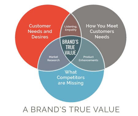
We saw the need to position the company as the high-level thinkers, consultants and innovators they actually are. Their global presence needed to be more prominent to show authority on a big scale. Through our 3-Step “Break Through” process we got to the true value of this company.
We dissected what their product does, how it works and why their clients should invest in theirs over competitors. Learn more about how a Brand Audit can reignite business growth
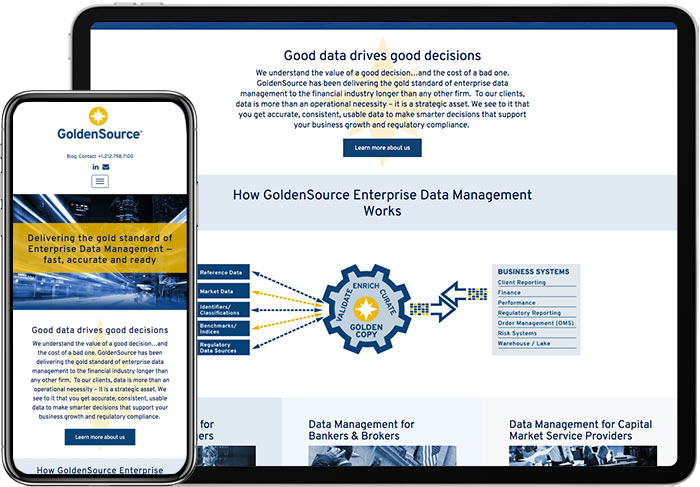
Understanding the product enabled us to create an infographic of the complex software so people get it in a few seconds. people can now draw it on the back of a napkin because we translated a complex application into a simple visual.
Using history as an asset
Because we focused on their accumulated expertise in financial software, their history became an advantage instead of a liability. In fact, we discovered their senior staff members actually created the original product and coined the term “EDM”, still used today. Even the CEO didn’t know that, which shows the importance of having conversations with people.
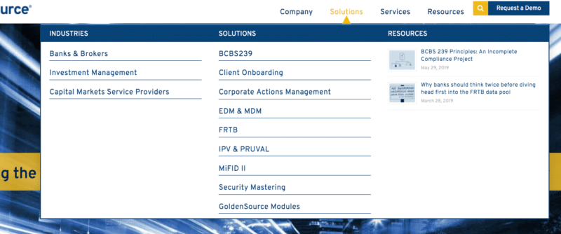
GoldenSource Mega Menu Design
Reorganizing the menu for improved UX
The website serves 3 major industries and combinations of software modules vary for each one. Before, visitors had to wade through 50 pages of services and attempt to figure out what was relevant to them. This was even more difficult because the page designs all looked the same.
Now, the mega menu is sectioned according to industry and includes only the modules specific to each one, making it clear which solutions work for each client. The menu also includes specific industry-related resources and client testimonials. We added other related items to the sidebar, such as testimonials and articles.
The website design direction
This was the fun part. First, we dissected the audience, their headaches, objections, and needs. The clients who use EDM software definitely have serious concerns, including compliance and government scrutiny, so the software must work as expected.
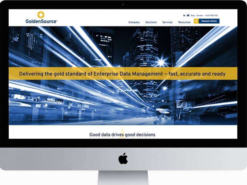
The headline we wrote, “Delivering the Gold Standard of Enterprise Data Management — fast, accurate and ready” accurately describes the product and addresses the needs of the user.
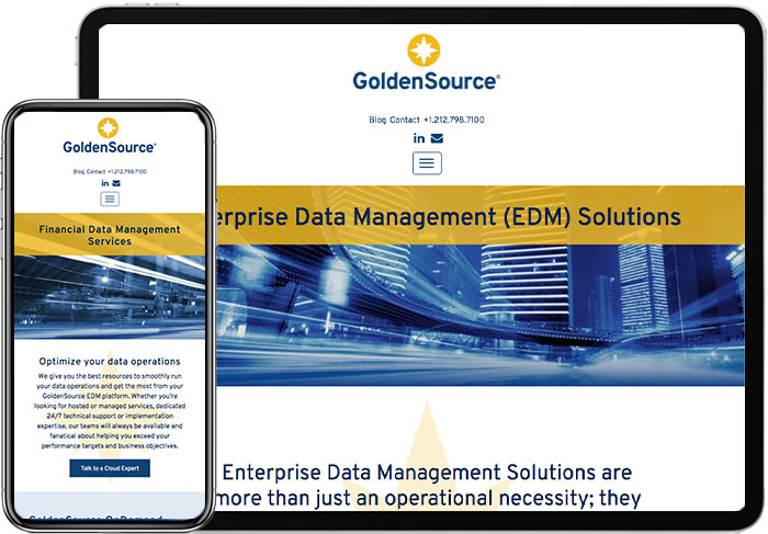
The images give the feeling of data zooming along and represent their global presence. Both of these qualities matter greatly to their clients. The result is a high-level website that serves their purpose, value and expertise.
Learn more about our website design & development work
Here’s the original Home Page of the site. It was a slider with rotating images like these:
