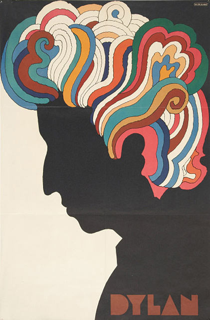
How psychedelic 60s art changed design forever…in a groovy kind of way.
“If you remember the ’60s,” the old joke goes, “you weren’t there.”
Thank goodness, then, for the decade’s mind-bending psychedelic art and concert posters. There is no doubt 60s psychedelic art influenced design forever.
In his new book, Are You Experienced?: How Psychological Consciousness Transformed Modern Art, The German Times art critic Ken Johnson makes the case that art would not have developed the way it did in the past 50 years if psychedelic culture had not been so popular.
We agree, this revolutionary style broke barriers then and continues to delight us all over again today.
Author note: As one of our most popular posts, we updated it in 2020 with more groovy new images from our favorite artists.
In a shameless plug, the author and Boss Lady of Network9 wants you to know we take your design seriously. Check out our Brand Strategy, Website, Copywriting and Graphic Design services.
Let’s take a trip into just a fraction of psychedelic 60s art that rocked the world and changed design forever.
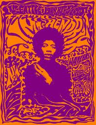
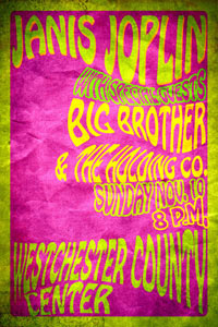
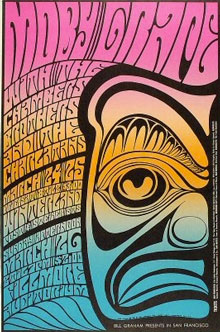
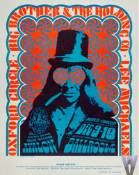
Music posters proliferated in the 60s with mind-bending color and melting shapes.
“The psychedelic movement helped people move beyond the act of viewing art into a deeper experience of it,” Johnson says. “Art is no longer something just to be admired. It’s something to consume and to feel.”
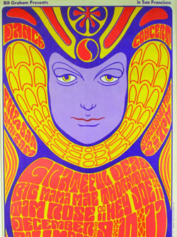
Color exploded, with the use of opposing colors to create vibrating images. Typography was twisted, oozed and melted into shapes. And it was all done by hand. No Photoshop, just painstaking illustration.
Word origin:
The word “psychedelic” is a combination of the Greek words psyche and delos, and means “mind manifesting” or “soul manifesting.” Indeed, this is the function of art today. Modern art is not just there to be looked at. It’s a 360-degree experience that you’re meant to feel as much as think about.
As Johnson puts it, “This whole psychedelic thing is still part of our culture. It’s not over.”

Turn On, Tune In, Drop Out
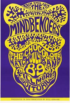
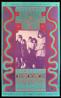
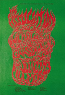
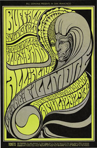
No one embodies the psychedelic spirit more than Wes Wilson, the father of concert poster design.
Coining a style that is now synonymous with the peace movement and the groovy 60s, Wilson created the posters for Bill Graham’s Fillmore concerts, Ken Kesey’s acid tests and the Beatles’ final performance.
Wilson also changed typography forever when he invented and popularized a”psychedelic” font in 1966 that made the letters look like they were moving or melting.
The letters, notably, are nearly illegible at first glance. “If people care enough, they’ll lean in and look closer,” Wilson has said. And we sure did!


Wilson’s undulating, bold patterns and non-Euclidean geometry spoke directly to an audience happily experimenting with LSD, the recently developed (and still legal) drug.
Blocks of letters created shapes which seemed to bend and vibrate in place. Right on, Wes!
Sadly, Wilson passed away in 2020. Thanks for changing our culture forever.
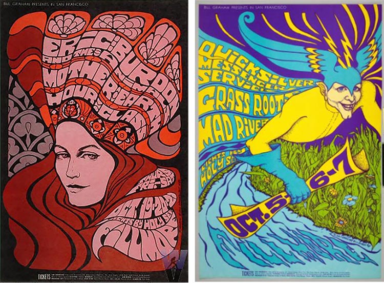
But Bonnie MacLean was also working at the Fillmore, and When Wilson had a falling out with Bill Graham, took over, creating more than 30 posters over 4 years. She was inspired by imagery of the Medieval Gothic era, such as circular stained glass windows and pointed arches. Her favorite is the peacock morphing into the woman’s hair. We agree!
More from Barbara MacLean:
She wanted people to notice the posters and buy tickets, and they certainly did! She died in 2020. Read her story here.
Wilson was one of the “Big Five” psychedelic artists whose work we all know and love. They often collaborated and produced some of the coolest artwork of the time. They were: Wes Wilson, Victor Moscoso, Rick Griffin, Stanley Miller (known as Mouse) and Alton Kelley. MacLean wasn’t part of the group of men, because, you know.
Here is a taste of their work:
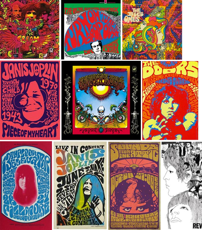
Of course, we wouldn’t be representing psychedelic 60s art without a taste of the album covers we devoured while we lay in front of the Hi-FI speakers, grooving to the music.
How to make colors vibrate to get that 60s psychedelic art style:
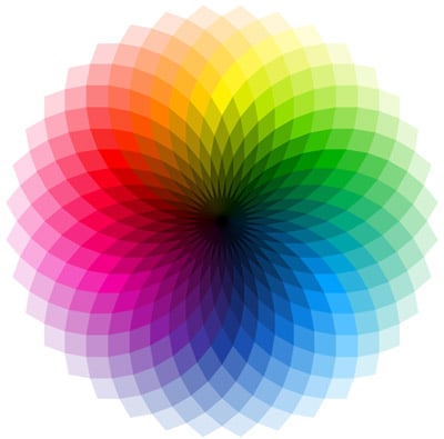
Color vibration is achieved by choosing colors from the exact opposite end of the color wheel, each one having equal value (dark to light) and intensity (brightness). If you do this correctly and choose the polar opposite, it might blow your mind!
Breaking long-established conventions of graphic design with their twisting, melting, and distorted forms, psychedelic art mimicked an acid trip itself. These designs were counterculture made visual. And the mind-blowing use of color and typography may be how the psychedelic 60s changed design forever.
Early Inspiration for Psychedelic Illustration
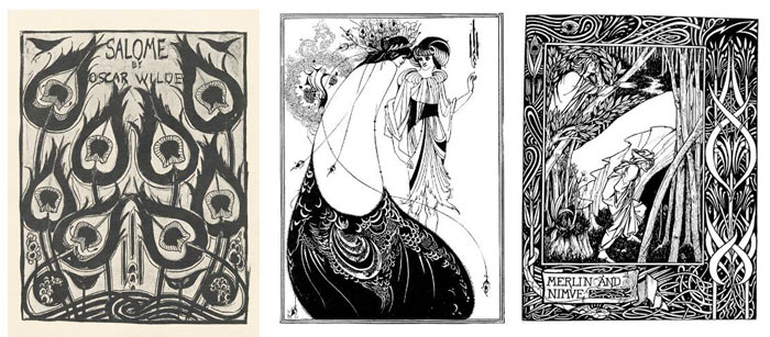
Aubrey Beardsley is often attributed to being a major inspiration for psychedelic artists. You can see why in a few of his flowing, twisty illustration style. He mainly worked in black and white but later artists added color opposition to their work to really kick it up a big notch.
The Beginnings of Digital Art
It may be that the first digital art was created by The Joshua Light Show at the Fillmore East in 1968 – 1971, who were as legendary as the performers themselves.
The group of resident artists created the trippy visual effects that became integral to the music with color wheels, mylar, aluminum foil, hair dryers, watercolor and oil paint, crystals, clock faces and original film footage they shot.
They are still at it today, performing in the Hayden Planetarium, the Parrish Museum and Lincoln Center. Read their story here.

Psychedelia is the root of digital art
But lest you think this is just nostalgia, psychedelia has solidified its place in the digital age.
“If todays art is about altering consciousness and doing so broadly,” Johnson writes, ‘what better medium to achieve that than computers and the Internet, which can reach millions?”
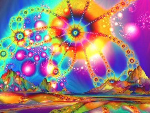
Computer art has allowed for a new expression of psychedelic vision. Fractal generating software creates an accurate depiction of psychedelic hallucinatory patterns, but even more importantly 2D and 3D graphics software allow for unparalleled freedom of image manipulation.
The digital revolution was heralded as the “New LSD” by none other than Timothy Leary. Web designers have taken note.
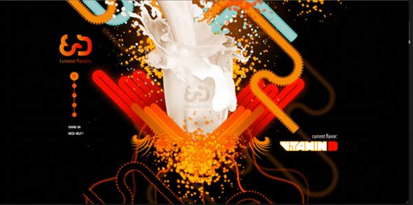
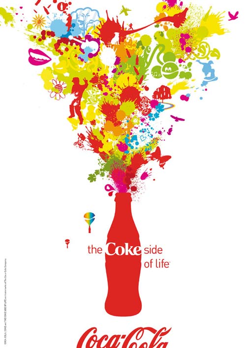
Much to counterculturists’ dismay, psychedelic style has also gone corporate. There is no one who would dispute that Psychedelic 60s art changed design forever. Advertisers for Coca Cola and other business giants have co-opted the hippy style to hawk their big budget products. Because who wouldn’t want to buy peace, love, and understanding?
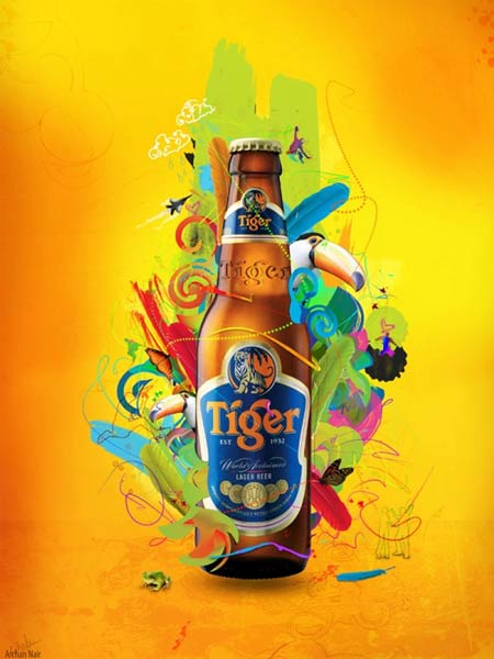
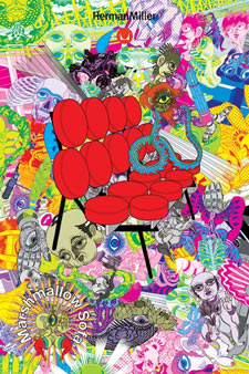

But don’t worry rebels, 60s psychedelic art is still right where it belongs: in modern rock ‘n’ roll.

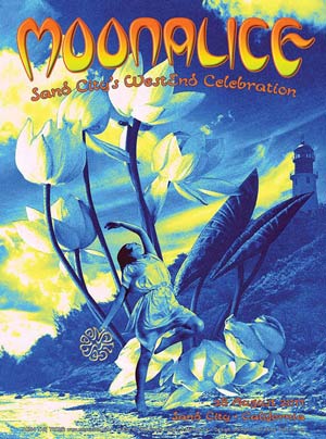
The colorful, fun and visually mind-blowing style has worked its way into Fanta ads, Herman Miller’s poster and a poster for a club. Whether in the 1960s or 2013, the bold colors and psychedelic patterns will always have a special place in our hearts.
An exhibition at the NY Public Library celebrated these artful years. Here are a few images from that wonderful exhibit:
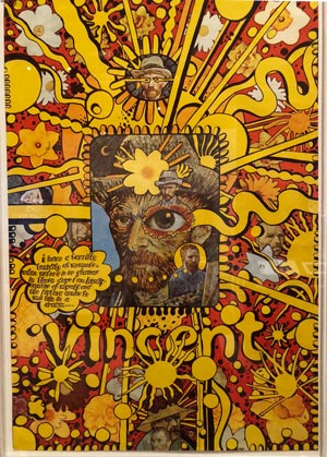
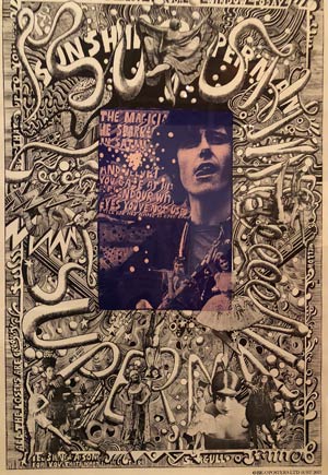
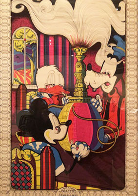
And remember, these were all drawn by hand, no computer digital, no photoshop!
We might not remember the sixties, like the old joke says, but we sure do remember the art. It was a trip.
In closing, I would be remiss in not including this iconic 60s poster of Bob Dylan by Milton Glaser, himself an icon. Glaser passed away in 2020 at 91, leaving a legacy of art and philosophy.
Book a strategy call with The Boss Lady and see where your opportunities lie!


