More than design, this project set the bar for Brand Standards.
Designers never want to think of ourselves as janitors, but in the 1970’s they cleaned up one huge mess. Subway signage. How can attention to design tame the beast of a system that millions of New Yorkers and non-English-speaking tourists use every day? This is how design saved the New York City Subway.

The existing signage was an evolution, not a plan.
As the subways evolved, the signage in the New York City subway system became an incomprehensible maze of bad directions and confusing messages.
At one point New York Times architecture writer Paul Goldberger declared that the signs were so confusing he wished that they weren’t there at all.
Designers changed all that. With the help of Helvetica, they tamed the beast—Davids against the underground Goliath. Great design took a bewildering labyrinth and created a modern signage system built to last.
The story of New York’s subway powerfully shows that design is not a product of its environment—the environment is a product of its design.
It’s A Helluva Town

All designers are familiar with the conflict between the purity of design and the messiness of the real world. And New York in the 1970s was messy.
“The subway made no sense,” said New York historian Paul Shaw. “There was so much clutter and so little consistency.”
Consistency! The magic word. The signs in the New York City subway system were a bewildering hodge-podge of typography, sizes, shapes, materials, colors, and messages.
 Read more about brand style guides here.
The New York City subway needed a signage system to save the riders from utter confusion. It needed a uniform, and fast.
Designing a system
The city, then under the forward-thinking mayorship of John Lindsay, had an idea. They hired the design firm Unimark International to untangle this visual mess.
Designers Noorda and Massimo Vignelli made it look easy. They didn’t just design signs, they designed a system that saved the New York City Subway.
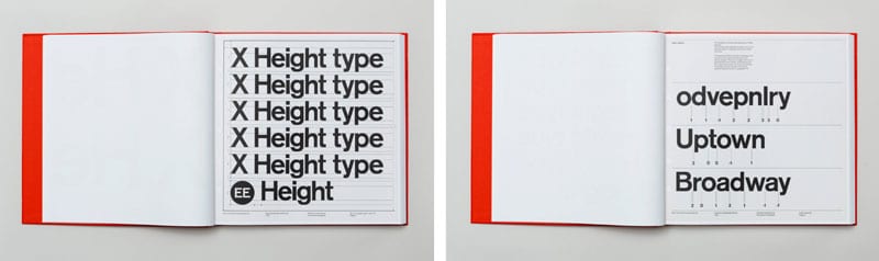
They studied and rethought the way people used the subways, and turned their findings into a system that makes graphic designers swoon. They gave the system its sans-serif typeface. Since sign-makers could not yet print Helvetica, they settled initially for Standard Medium, a clean, easy to read font.
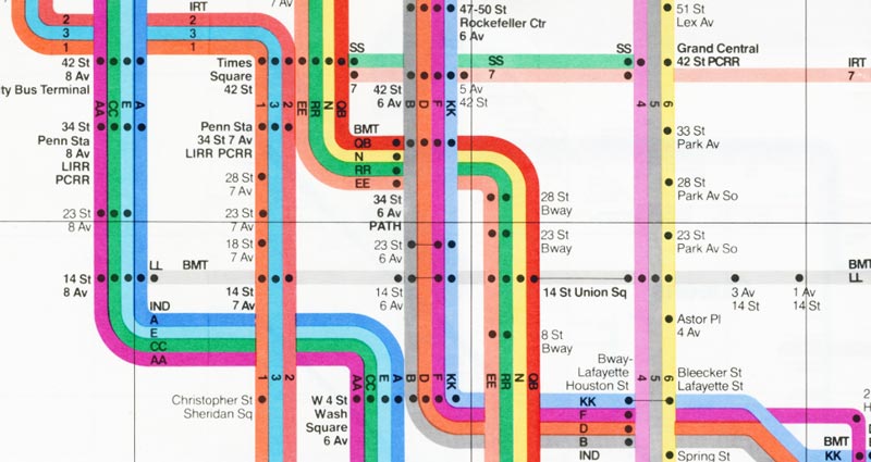
The big idea was to color-code and number the various lines, so goodbye IRT and hello 4,5,6.
“Every line a different color, every stop a dot.”, Vignelli said. The color-coded disks we know today made for simplified, easy-to-read signage.
Noorda and Vignelli wrote crystal clear guidelines in their Standards Manual, a document recently uncovered in a garage and now considered the Rosetta Stone of urban planning.
“It’s pretty much a design bible as far as standards manuals go,” Skourtis says.
Design is thinking about how people think
Vignelli and Noordis’ design was not merely intended to look good — which it does — but to simplify navigation of the subway for the passenger. They upheld another design principle: you gotta be able to use it. The original UX designers!
Like all great designers, they placed themselves inside the minds of the people who would be using their product.
“The subway rider should be given only information at the point of decision,” proclaimed the designers. “Never before. Never after.”
The designers anticipated the exact moment when you would need a certain piece of information, and they give it to you exactly at that point.
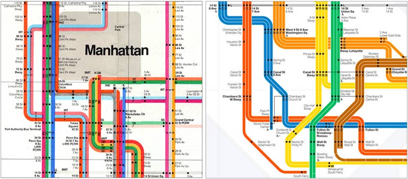
A wonder of precision, the Standards Manual even addresses the heights of conductors with and without hats. Vignelli went a step further and in 1972, designed the extraordinary subway map that we know today. He’s still at it, and recently designed “The Weekender” for digital devices.
The one thing that wasn’t uniform!
The mosaics on each subway stop. These were created in 1904, without a streamlined system (branding guidelines, people!). During the subway reboot, the designers decided it would be too much trouble to replace them and opted to keep them as they were.
In this case, inconsistency was a good call. The subway as a whole was completely streamlined, but each stop carries the personal touch its creator gave it. These mosaics are beloved to all New Yorkers.
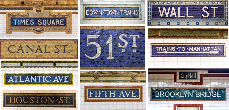
The Forgotten NY blog has a great collection of these signs too.
Just because something is in uniform doesn’t mean it can’t also be unique.
Some things have changed in the last 50 years. Standard Medium has been (rather famously) replaced by Helvetica. In an effort to discourage graffiti, signs now feature white lettering on black, as opposed to Unimark’s prescribed black-on-white. It looks better today than ever.
This is the current design, simplified but still retaining the brilliance of the original.
Designers know order trumps chaos. The best design is often invisible, so clean and efficient that we don’t even realize the way it directs our experience.
As the old saying goes, “perfection is achieved not when there is nothing more to add, but when there is nothing left to take away.”
Anyone who rides the NYC subways knows how well this works. All aboard for a great design experience!