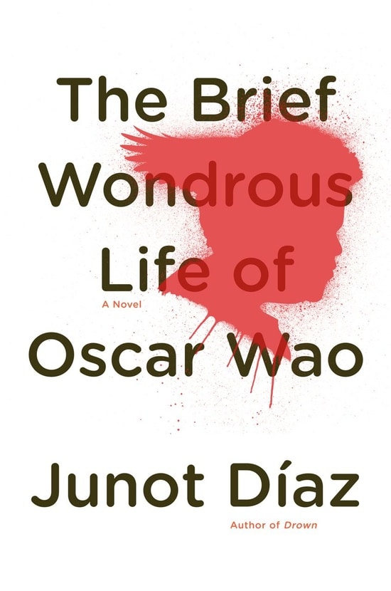
Judging a book by its cover actually does work, sometimes.
Carmen Yazejian was looking for something to read on a plane trip, and stopped into the airport bookstore.
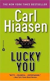
“Sometimes a book cover jumps off the shelf. Carl Hiaasen’s “Sick Puppy” did that, and introduced me to an author who has become one of my favorites. All because the simple green cover with the dog’s head stood out among all the clutter.”
Yes, you can judge a book by its cover (design).


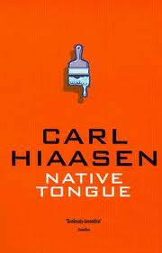
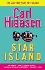

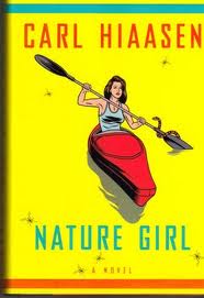
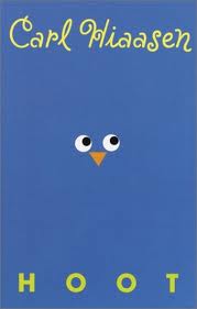
The ability of a designer to distill a book’s contents with visual simplicity is a rare gift indeed.
Typography adds a suggestion of the plot. Great book cover design strides boldly into the realm of fine art. Forget about e-books, it says. You want to hold it, own it and buy it for your friends.
Like all the best designs, it makes you wish you’d thought of it yourself.
Here are the stories behind some of the best.
The Classics in Blue
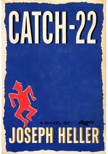
The “Big Book Look” is characterized by the title and author’s name in large, strong print. It was pioneered by Paul Bacon, the cover designer of Catch 22. His electric blue design is still frozen in our memories.
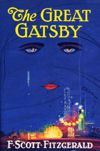
Another small blue cover that made a huge impact? Look no further than The Great Gatsby. Gatsby’s cover depicts disembodied eyes and a mouth over a blue skyline, with the image of a naked woman reflected in the irises. Today it is among the most celebrated pieces of art in American literature , but it was designed by a complete unknown artist at the time.
Francis Cugat was commissioned to design the cover of the novel while Fitzgerald was still working on it — when Fitzgerald saw the cover, he liked it so much that he told his publisher that he had “written it into” the book. His pal Hemingway, on the other hand, hated it. I wonder why?
We’ve told you before that blue is the hue, and the proof is in these covers:
From Books to Movies: how book cover design changes
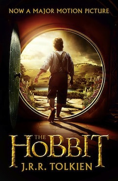
Book marketers know how to capitalize on the release of a new film that has been adapted from a book. Usually, this means replacing the original cover with a revamped photo of the actors (think: Leo Dicaprio inviting you to read The Great Gatsby). It’s a movie poster on a book. This trend makes many book lovers shudder, but it’s a proven way to attract new readers.
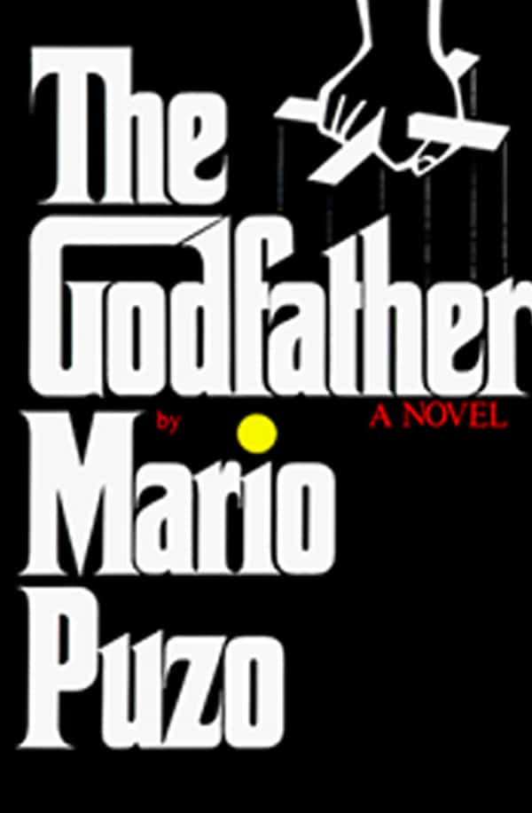
Sometimes, book covers inspire the movie posters themselves. Take The Godfather. Everyone has seen Marlon Brando poster, but few know that the design came straight from the source. The design for the cover was done by the inimitable S. Neil Fujita, whose heavy, gothic typeface was carried over to the imagery for the film.
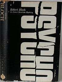
Tony Palladino’s cover art for Psycho also made it to the promotional material for the big-screen adaptation, which has added to its iconic status.
However, we think the enormous, sideways, slashed-through title would have held up on its own, Hitchcock or no Hitchcock. These instantly recognizable book designs make easy to judging a book by its cover.
More often though, Hollywood’s version imposes itself onto the book design.
Here are a few recent examples of book covers that featured no characters at all originally, but were adapted to feature the big-budget stars of the feature films.
Typography Uncovered
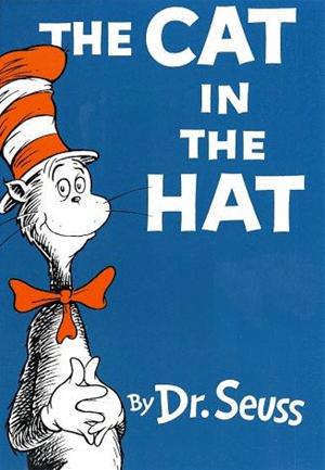
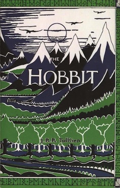
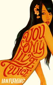
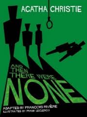
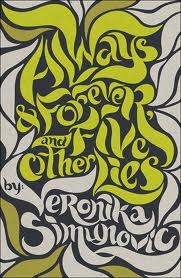
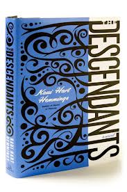
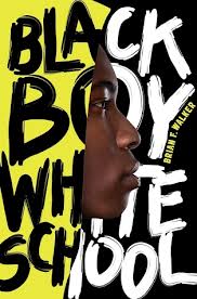
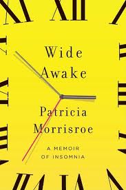
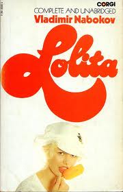
There’s no better canvas than a book cover for typographers to work their magic. Type can tell the story in a visual way while the words within tell theirs. Here are a few of our favorite book covers:
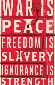
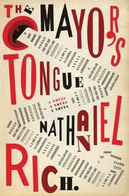
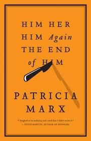
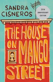

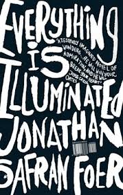
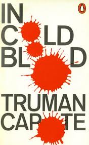
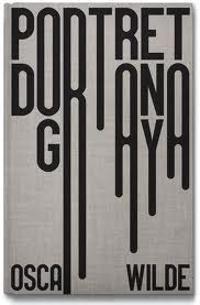
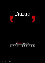
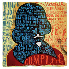
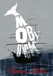
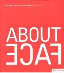
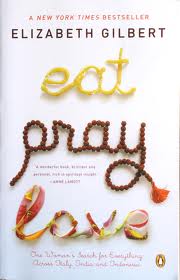
Modern Fiction digital book cover design
In modern fiction, hand-drawn art has been replaced by digital images in many cases, but a great cover still tells a story but leaves something to the reader’s imagination.
It’s hard to tell what some of these covers mean—but they make me wonder what the book is about. I have to take them home to find out, but I bet the meaning will be revealed in the story.
Have a favorite book cover? Do you cringe when your favorite book is hijacked by its movie? Connect with us @Network9 — where book and design lovers unite.

