Let’s explore why minimalist design works in communicating an idea
Minimalism is a philosophy. It means stripping down a design to what is essential, leaving out decoration. That may mean different things to different people, but to us, it means “keep it simple, stupid.”
Boss Lady Carmen Yazejian says:
“When it comes to your company’s visual voice, trim the fat. Show the best and forget the rest.”
Our clients often say they want “something simple”, but they mean “Cheap”. Making things simpler is actually more work. We have to determine what is a priority and what a visitor needs to be there to get what the want.

Apple always understands why minimalist design works in their web pages. They focus the user on one gorgeous product at a time, with exactly the right amount of information they need to take the next step in purchasing. It has proven to boost sales.

All that being said, our own website designs are getting cleaner all the time as we focus the user’s attention to one thing at a time. Cramming more onto a home page doesn’t work the way people think— too much clutter makes people shut down and lose focus.
Simplicity is the Ultimate Form of Sophistication

Japanese floral designers know it, Bauhaus designers made it a philosophy, Frank Lloyd Wright practiced it, and Steve Jobs built an empire on it.
Apple’s visual voice followed his passion for a simple user experience, and form followed this function. From its products to its stores to its ads, minimalism was king, down to removing the last screw.
He was a master of minimalist design because he took away what wasn’t needed. These iPod ads were just too cool for words, because they showed the product and the way people feel using it, without words.


When Steve Jobs died, the perfect tribute was this loving, simple fan design that went viral in hours.

As Jobs himself would say, “It’s insanely great.”
Apple’s not the only company to see the power of simplicity.
In a world of clutter, minimalism is a way to cut through the noise. And don’t ad makers know it.
As Albert Einstein said, “If you can’t explain it to a 6-year-old, you don’t understand it yourself.”
Minimalism’s haters say that less is less.
Well, yes, it may be true that you wouldn’t be cramming a lot of information into a flyer, but how much can people remember and take action on?
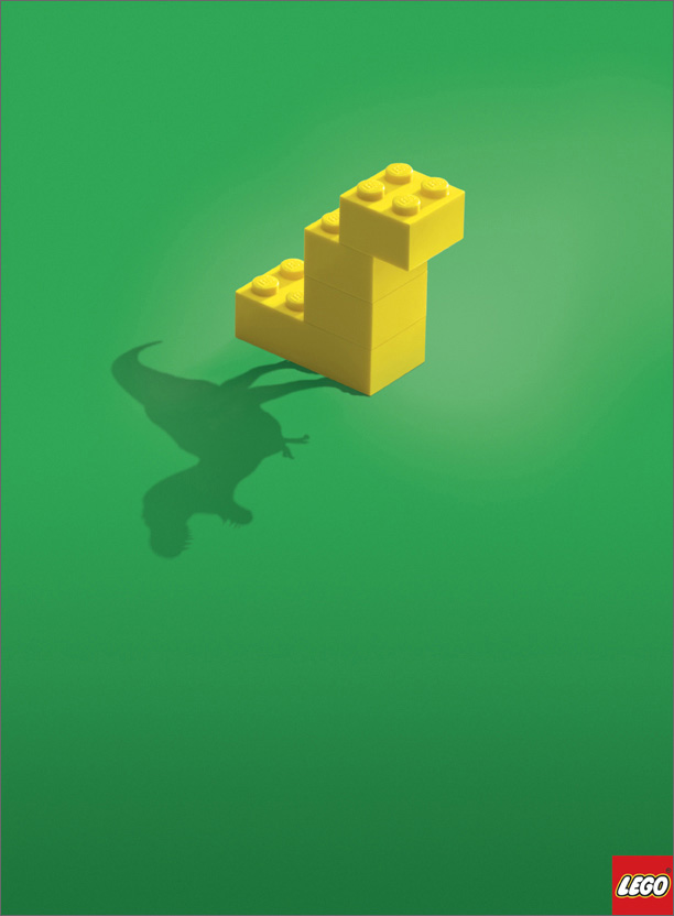
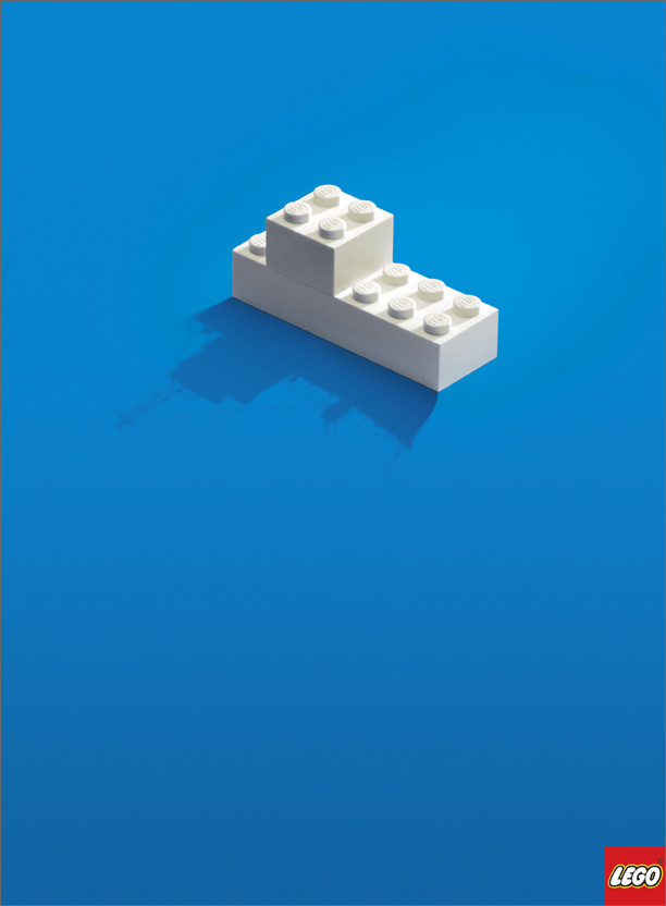
Look how much Lego did with so little.
Anyone who has constructed a lego project knows their instructions don’t even have words, just like these ads.
Yet we get it in an instant, because we use our imagination, just like the kids who play with them. From Bauhaus to Helvetica to haikus, simplicity works across all mediums.
Famously, Ernest Hemingway was once asked to write a story in 6 words.
His response? “For sale: baby shoes, never worn.”
Minimalism in action!
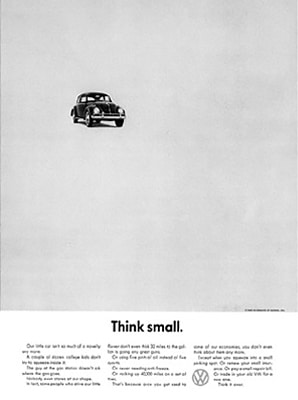
The legendary VW ad below launched a company. No one ever heard of this car, and at the time, were driving behemoth-sized, chrome covered, tail finned cars.
How they created desire for the small vehicle went down in advertising history.
The minimalist design with huge empty space made the car stand out and appear even smaller, which was the fun of the car. Heck, we had one! This is a prime example of making lemonade out of a lemon.

If you enjoyed this post, check out our post on Judging a Book by its Cover
Have ideas on why minimalist design works?
Tweet at us @network9. After all, 140 characters is the perfect chance to practice some minimalism of your own.


