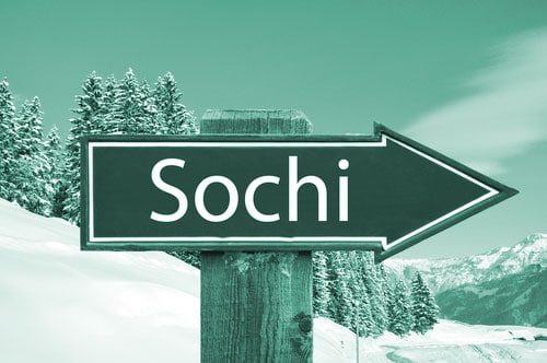
This year at Sochi, they rebranded a nation.
A change in direction was necessary because of their rather negative global image.
But I absolutely LOVE the Olympics, no matter who is hosting it. The games bring the world together to duke it out in a safe way.
I watch everything, even Curling, that is if I’m up at 3 AM and can’t sleep.
The Olympics are never without some political tension or unrest, but this year in particular, tensions are high. One of the world’s most controversial nations is hosting the games.
Russia has been on the map recently thanks to the recent Russian-Georgian war, anti-gay laws, human and animal rights violations, excessive expenditures and mistreatment of journalists. Vladimir Putin, who lit the Olympic torch during Opening Ceremonies, is perhaps one of the most vilified leaders in the western world.
But Russia was chosen by the committee anyway to host the Olympic Games. And every Olympic Games needs a brand.
At Network9, we began to wonder: What if Sochi 2014 was our client?
Can you imagine Putin walking into our Gramercy Park office, asking where he could hang his sheepskin mouton? Brigitte would probably offer his dozen bodyguards some tea, and maybe Julia would think for half a second about sniping a picture for our Twitter. Before realizing that, should she manage it, she probably wouldn’t make it back to Brooklyn.
But in our fantasy, Putin tells Carmen that Sochi is coming up and, of course, want us to create their Brand Identity Design. For a few weeks, the world’s eyes are going to be on Russia. So we would ask him what does Russia want their Olympic Brand to communicate?
Anyway, another agency got the job, so let’s take a look at what the brand design firm, Interbrand, did for Sochi.

First things first. This is the first Olympic brand since Mexico 1968 NOT to include a “logo”. That is, this brand creation uses only typeface and the Olympic rings. Bigger than that, this logo is the URL of the website, not just “Sochi”, in order to promote the digital brand. Clever! Still looks like a logo to us, though.
Check out our Logo Design work here
Interbrand went with a modern Russian-inspired type-face and a web url (.ru is the extension of Russian domains) in order to:
“underline the innovative character of the games and its relevance for the whole country. And to convey dynamism and for potential extension into 2D, 3D, and 4D…”
In other words, this brand is supposed to evoke a mega-modern feeling.
According to Interbrand “the visual identity of the brand is inspired by the idea of traditional Russian patterns, re-interpreted in a modern way”.
We can see the inspiration:
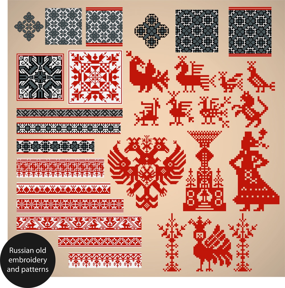
By putting a modern edge on these patterns, Interbrand wanted to bring Sochi into the 21st century, divorcing it from the Draconian politics that dominate headlines. The merchandise also hearkens back to the roots of Russian design, while updating the color schemes and text-treatments in order to look hip in the digital age.

Posters for Sochi 2014
While the marriage of traditional and modern elements isn’t terribly unique for Olympic branding. Take a look at Beijing 2008 or London 2012’s outrageous Industrial Age-inspired opening ceremony. Russia, in particular, seems determined to keep the world’s eye on either their distant past or their prosperous future. Definitely not on the trials and tribulations of right now.
Read more about rebranding pros and cons here
How successful will Russia’s rebranding be throughout Sochi?
So far, the controversy hasn’t been put to rest, and bad news continues to pour out of the spotlight nation. But the thrill of the games and the support for the international athletes keeps people tuning in, and ratings are in line with Vancouver’s 2010 games. There may be time for the trending news to shift from negative to positive.
For the record, we’re glad we don’t work for Putin. But if we did, Sochi might have been the biggest rebranding challenge of our career.