A brand transformation from generic to super specific
The PNATC website design and rebrand was more than that. A new position was needed to show their service as aspirational & one that makes wishes come true. Their consultancy services are different than other QuickBooks agents. We discovered why by taking them through our 3-Step “Break Through” process, dissected their product, how it works—and why their clients cannot do without it.
Distinguishing PNATC from competitors
The PNATC website design and rebrand specify a very important difference between them and other QuickBooks agents. Because their parent company is an accounting firm, they understand what accountants need. They are then able to add and modify the QuickBooks application to integrate with each CPA’s needs. We wrote detailed copy that creates value and shows problem-solving.
The PNATC website design and rebrand direction
This was the fun part. First, we dissected the audience, their headaches, objections, and needs.
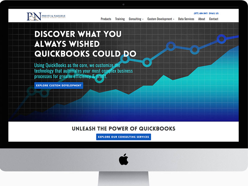
We wrote the headline:
“Discover what you always wished QuickBooks could do” It tells bookkeepers, CPAs and data entry staff that the product can be made to do exactly what they need it to do.
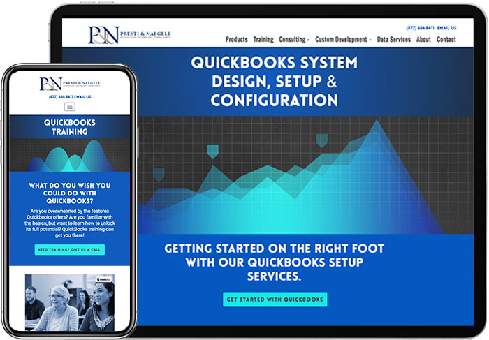
The images all use graphs and data symbols, with glowing, super-bright blues that pop off the pages. The result is a visually energetic website that serves their purpose, value and expertise.


