A More Personal Website
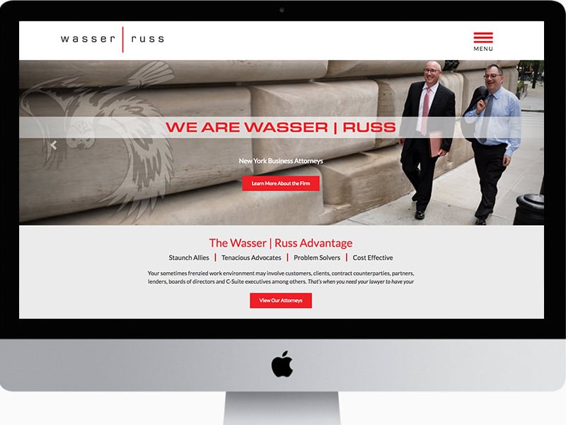
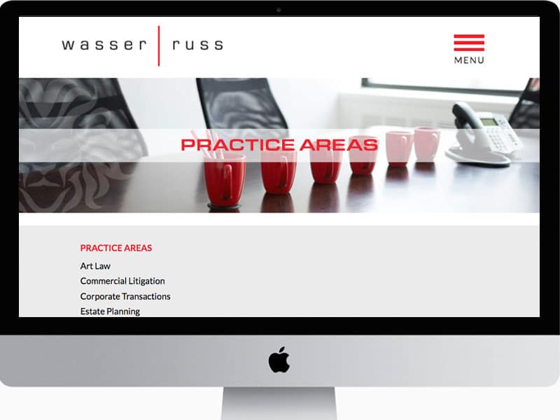
Wasser | Russ was ready for a more sophisticated website design that matches their current level of clients and business. It captures their personality & work ethic, and the result is an attorney site unlike any other. Typically, law firms use generic, corporate copy, and sound like everyone else.
The photography
With custom photography by Michael Meyers, we were able to give visitors a more personal experience of Adam and Doug. Clients feel more of a connection because they see Adam & Doug in action. Prospects get a friendly, approachable vibe, making it easier to pick up the phone and call.
The copywriting
We worked closely with Adam and Doug, the partners, to translate their personalities into the words that express who they are. Using their own words, people have a real sense of what it is like to work with them and the personal attention they get. In a small firm, this is a big advantage over large firms because clients often get shuffled off to junior partners.
Learn more about our writing services
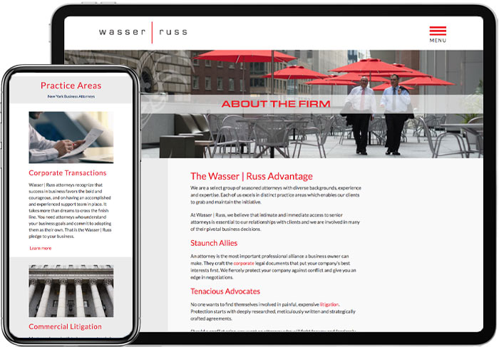
The Wasser Russ website design is fully responsive, of course.
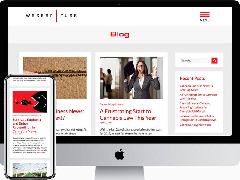
The pages and posts are properly optimized for SEO and their blog has a clean, bold design with touches of their brand color, blood red. Images are customized in the brand colors to give a distinctive, cohesive look to the posts.
The Logo Design Idea
The logo came from the idea of representing the partners as friendly and approachable, which they are, hence the lower case font. But, when the time comes, and they need to go to bat, they can draw blood if necessary. That’s why the line became red, an unusual color for a law firm. A staunch ally is exactly what people look for in an attorney.
Learn more about Network9’s Website Design services
Explore ideas on website design in our blog


