
Is yours a mobile friendly website?
In the infamous Mobilegeddon, Google announced they’d reward websites that were mobile friendly. Many business owners grabbed their smartphone and called their web designer. Some didn’t. If you’re one of the holdouts, here are some surprising stats published by Mobify that might change your mind:
- 57% of users say they would NOT recommend a business with a poorly designed site
- 30% abandon a transaction if it’s not optimized for web
- 57% abandon your site if it takes more than 3 seconds for a page to load
We asked Heidi Cohen, Chief Content Officer of the Actionable Marketing Guide—to weigh in on how critical adapting for Mobile Devices is for today’s online marketer. Here’s what she shared with us…
“Marketing is spelled M-O-B-I-L-E. Marketing must be mobile first, or you’re invisible to your prospects.”
Smartphone-dependent users are increasing
The number of people who exclusively use their phone for internet access is growing. Their broadband access may be limited at work or at home, or they only own one device and this is the only option they have to get online.
“Mobile is no longer nice to have. It’s where your audience spends their time. People use their mobile devices 150 to 200 times a day yielding about 30 billion US mobile-moments per day.”, according to Forrester Research.

To give you an idea of how sweeping the mobile-friendly website trend is, here’s a snapshot of time spent—in hours-per-day by age demographic—for mobile device use.
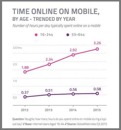
Graph courtesy of Global-Web-Index. Even though this is a few years old, we know these percentages have only gone up for mobile.
Let’s debunk 5 Myths that may be holding you back from adapting your website for mobile
Myth #1: Mobile Devices are just smartphones and tablets
“If you’re not on mobile, you’re not reaching your maximum potential audience.” Heidi Cohen
- The Consumer Technology Association (CTA) predicts that sometime within the first 10 months of 2016, the number of adult wearable device users is expected to reach 63.7M.
- Of that number 35% will be a Smartwatch. The micro screen is making large fonts and pared down messaging critical.
- Siri and other automated assistants will make search and accessing content easier, (still a challenge on small screens) but the rest will need to be readable.
Myth #2: A widget will take care of the problem
Using an application that adapts a website to mobile does work. Well, sort of. It adapts your site’s code and CSS and displays it in a vertical layout. But there’s more to it than that. To maximize your customer experience, you’ll eventually need to redesign for mobile first. Reformatting your copy to be more concise, adding sections of content, bigger buttons and making it more visual will add to the mobile experience. The days of long blocks of dense text are over.
Myth #3: People only search for addresses while they’re out and about
The reality is billions of dollars change hands between people using their mobile devices each day—eMarketer estimates totals to reach $27B in 2016.
By 2019, that total will be closer to $210B. People are shopping, not just looking for an address or phone number. Commerce sites are moving towards developing apps just for mobile devices. Mobile payment systems are exploding.
Myth #4: Your site will go down for a long time
The fact is you can keep your current site live until the moment you launch your new site. It only takes about an hour to propagate, and you schedule your transition for the off hours.
Your web designer will know how to create a mobile-friendly website and when to push the button.
Myth #5: It’s too expensive
Think about who might be clicking off your site because of a poor mobile experience. How many clients are you losing and what is that costing you? Users have little patience and want to get what they need quickly. They’ll go elsewhere to get it.
Conclusion
The Mobile Device has revolutionized web design. With its own design ecosystem, fonts grow larger, messaging is more concise and users scroll with the swipe of a finger. Each of these components weaves together an optimized viewing experience on the small screen.
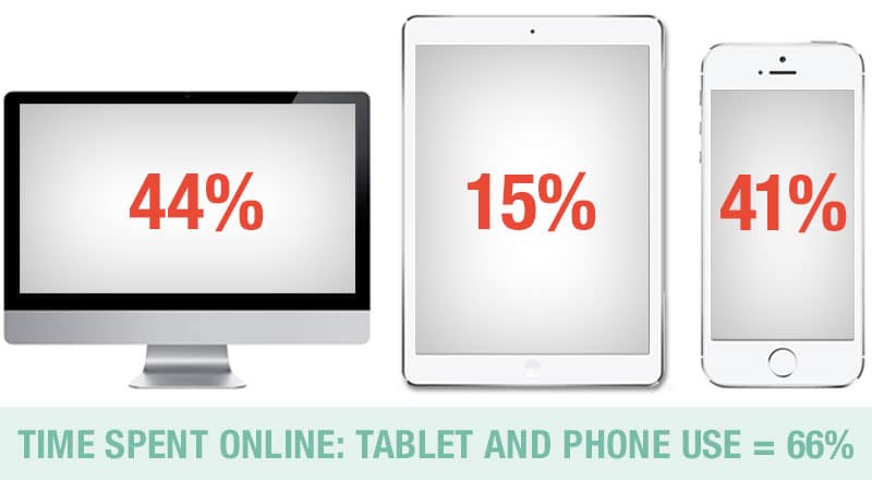
People are spending less time on their desktop and more time on smartphones and tablets.
They may not always be at their desk, but they always have their phone. Enhancing usability and simplifying your buying process will not only make your site visitors happier, but it will also encourage them to purchase and to share your name by word-of-mouth referrals.
Adapting to a mobile friendly website is not a nice-to-have but a must-have in 2016.
Our thanks to Heidi Cohen for providing her insight